| Misplaced pixels in 16 Colours |
|---|
|
The Paranoid started as a graphician for Atari ST games initially for
Solution Software. Later on, he focussed on graphics for demos
and provided a few pictures for graphic competitions on various parties.
Below you can find a selection of the pictures done during that time, each features only 16 colours out of 512, is 320 x 200 pixels in size and has been painted in DEGAS Elite (with one exception). |
|
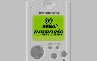
DC VMU - Done for Fun in roughly 1 hour The Visual Memory Unit (VMU) for the Dreamcast is a fascinating little device: Primarily intended to store game stats it is a complete pocket game system that Paranoia even wrote a little intro for in 2003. The graphic in the miniscreen is in original resolution (48x32 1bit), the VMU itself uses just 8 colours. |
|
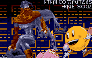
Soulful - Scored 3rd place at the EIL #2 An attempt to do a similar picture as Lario Bros. (see below), this has been done in a hurry while Rock Solid has been developed. |
|
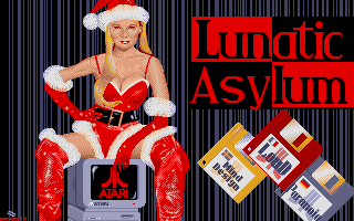
Xmas 2000 - Done for the Christmas Intro 2000. Intended as intro-picture for the Christmas Intro, this has been inspired by an advertisement campaign of a well-known tobacco brand. |
|
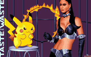
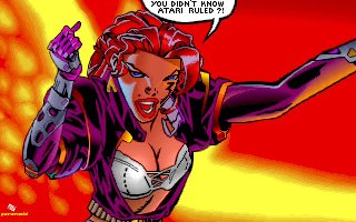
Taste the Waste! - Scored 2nd place at the UC 2000. Again, a well known tobacco brand advertisement has been the basis of this picture that tries to combine two totally contradicting characters. |
|
Same stEIL Scored 1st place at the SV2000. This is the only Falcon Hi-Colour picture done in No's Escape-Paint. Mainly done to enter something into the graphics competition for the SillyVenture party organized by Grey of Mystic Bytes. |
|
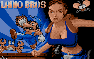
Evolution ? - Lario Bros. - Scored 2nd place at the PMP. An experimental picture trying to use ordered dither as far as possible and was mainly finished on the PMP party itself. |
|
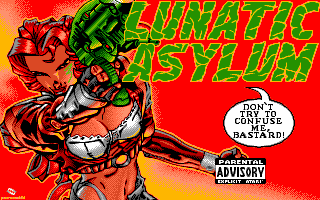
Lunatic Asylum Scored 3rd place at the EIL'99. The cover of a Rave album was the basis for this picture, which took a long time and had major parts being redrawn a couple of times because of palette optimisations. |
|
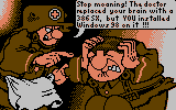
4 Colours Done for the DHS 4 Colours compo in 1999. The competition this picture was made for only allowed 160 x 100 pixels and 4 colours - which is good enough for a cartoon inspired scene like this. The scene is more or less taken from an album named "The Stormtroopers" by Bonvicini. |
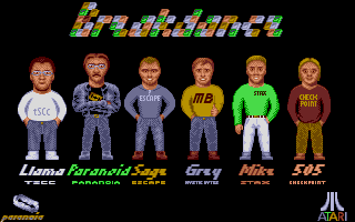
|
Breakdance Used as a title-picture in the game. |
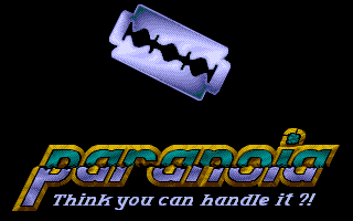
|
The first Paranoia-logo. As usual, done in a hurry for the ongoing projects just after Paranoia has been formed. The logo has not been used very often, but the razor blade persisted. |
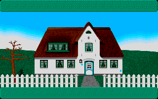
|
Done for Solution Software's ESLA League Manager III. Used on special occassions, the greenish fields on top and bottom are used to display text regarding this special occassion. |
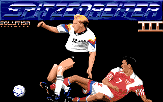
|
Done for Solution Software's ESLA League Manager III. The designer of this game had very precise thoughts about how the title screen should look like so this way taken from a Soccer magazine. |
|
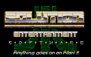
The final Solution Software logo. Actually, this is third incarnation of the logo and was only used in the game Nightfall. |